
The modern corporate landscape is defined by profound attention scarcity. Executives and venture capitalists are overwhelmed with data, reviewing thousands of proposals annually.
In fact, recent data indicates that investors spend an average of just 2 minutes and 42 seconds on a pitch deck before making a decision. In this high-stakes environment, a generic white template is no longer enough to hold their attention.
To stand out, your visual communication must be as sharp and innovative as your business model. Enter the Dark mode presentation.
What began as a popular software interface trend has rapidly evolved into a dominant aesthetic for corporate communications. It is fundamentally changing how we process information in the boardroom.
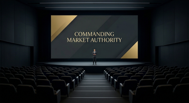
By shifting the visual baseline to sophisticated, light-absorbing dark hues, presenters can command absolute focus and project premium market authority.
In this article, we will explore the psychology and strategy behind this trend, and why black background slides are becoming the gold standard for successful business storytelling.
The Attention Economy and Visual Ergonomics
To understand the rise of dark interfaces, we must first look at the sheer volume of screen time modern professionals endure.
Extended exposure to glaring white screens causes significant visual fatigue, especially during lengthy meetings or late-night due diligence sessions.
A Dark mode presentation offers a softer, more eye-friendly experience that significantly reduces screen glare. By minimizing visual discomfort, you subconsciously invite your audience to stay engaged with your content for longer periods.
Furthermore, on devices with OLED or AMOLED screens, dark interfaces consume significantly less battery power.
This is a subtle but powerful signal. It tells your audience that your brand is modern, tech-savvy, and optimized for how people actually consume digital content today.
The Cognitive Power of High Contrast
The strategic advantage of dark backgrounds goes far beyond simple aesthetic appeal and battery saving.
When you place luminous, vibrant elements against a deep, dark background, you activate a neurological response known as the “pop-out effect.”
Dark backgrounds naturally recede, forcing the viewer’s eye directly toward the illuminated data points, charts, and key performance indicators.
This creates a superior visual hierarchy. Instead of competing with the blinding white space of a traditional slide, your core message commands the room.
It is ideal for minimalist, image-heavy presentations where visual impact is paramount. When executed correctly, this high contrast makes complex financial or operational data instantaneously digestible.
Investor Psychology and the Semiotics of Color
In investor relations, the aesthetic of your pitch deck communicates volumes about your brand’s maturity and stability before you even speak a word.
Deep, rich background colors—like navy, charcoal, or dark purple—are universally associated with authority, sophistication, and established success.
Late-stage funding presentations heavily utilize these deep tones to convey market dominance without appearing desperate or overly experimental.
However, you must be careful with your accent colors. Avoid neon or overly saturated colors, as they can quickly fatigue the viewer’s eyes and undermine the professional tone.
A meticulously crafted dark aesthetic separates your proposal from the sea of standard, templated white slides that constantly flood an investor’s inbox.
Best Practices for Dark Mode Execution
Executing a flawless dark presentation requires technical precision. Simply inverting your colors will likely result in an amateurish, unreadable deck.
Here are the critical rules for professional dark mode design:
- Avoid Pure Black and Pure White: Pure black (
#000000) paired with pure white (#FFFFFF) creates harsh visual vibration. Instead, use soft neutrals like deep gray (#121212) for backgrounds and off-white (#F1F1F1) for text. - Prioritize Accessibility: Ensure your text elements maintain high contrast ratios against their backgrounds. Adhering to WCAG accessibility standards is non-negotiable for modern corporate presentations.
- Calibrate Brand Colors: Your existing brand colors may vibrate uncomfortably against dark backgrounds. You must strategically desaturate or lighten your primary brand palette to ensure it remains legible and aesthetically pleasing in a dark environment.
- Mind the Room Lighting: Dark backgrounds thrive in dimly lit conference rooms or on individual monitors. However, they can suffer from limited visibility in highly illuminated rooms or when printed on paper. Always consider the delivery environment.
Elevate Your Corporate Narrative
The transition toward dark mode design is a fundamental evolution in how corporate narratives are visually engineered.
By leveraging the neurological advantages of high-contrast processing and the psychological weight of premium aesthetics, you can unlock a powerful new tool for your business.
Whether you are pitching to venture capitalists, submitting a high-stakes B2B proposal, or publishing an annual ESG report, the visual delivery of your data is your primary vehicle for engagement.
However, mastering this specialized discipline requires marrying overarching business strategy with cutting-edge visual science.
If you need to ensure your next presentation not only survives the boardroom but actively commands it, consult with the presentation design experts at TEAMPPT. We visualize the true value of your business.